Table of Contents
Wedding website examples help couples turn design inspiration into a clear page for guests, RSVP and private event details. The real test is not the layout but whether a guest knows what to do within a minute.
Couples searching for wedding website examples usually want to understand the structure: what belongs on the homepage, which details guests need and how the site stays private. Strong examples show more than design; they show a guest journey.
The catch with most examples is that they are shop windows. They show a couple, a photo and a typeface, but never whether the replies came back complete. An example only works as a template once you can trace a guest through it: open the link, find the date, accept, choose a meal, done.
So look at examples on a phone rather than a large screen. Most guests open the link in the evening, between two other messages — whatever is not on the first screen is rarely searched for, and whatever needs pinch-zoom is not read at all.
The focus here is on private wedding websites with RSVP, invitation code, guest list, photo gallery and optional custom domain. The goal is not an indexed couple page, but a useful guest experience and a strong public product page for creating a wedding website.
1. Sort examples by purpose
A wedding website can be save-the-date, invitation, information hub, RSVP flow and photo gallery at once. Examples should therefore be judged by purpose: do you only need date and venue, or should guests reply, choose menus and add plus-ones?
Three purposes come up again and again. A save-the-date needs one screen: names, date, town and one line about the details to follow. The invitation page carries the whole schedule plus the reply. The page after the celebration lives on the gallery and a thank you. Planning those as three states of the same page saves you a second address on a second card.
One case many couples have: register office now, the big celebration next year. Two separate pages are the weaker answer — two addresses, two guest lists, twice the upkeep and, in the end, guests on the wrong page. One page with two clearly separated blocks and its own reply per date works better.
A clear structure usually works best: names and date, timeline, venue, travel, FAQ, RSVP and contact options. Gallery, gift notes and accommodation can then be added without clutter.
The best example is not the prettiest layout, but the page where guests immediately know what to do.
2. Include what guests actually need
Guests need date, time, address, dress code, parking, transport, hotels, schedule, contact person and a simple way to reply. Good examples make those details easy to scan on mobile.
Two answers are almost always missing, and they cause most of the follow-up questions: whether children are invited and who may bring a plus-one. Both belong on the page in plain words, even when the answer is awkward — otherwise you give it twenty times in private, slightly differently each time.
Guests travelling in need more: the full address including the country, a note about rooms held for the wedding, and the latest sensible arrival time. Separation and patchwork situations are easiest to handle in the contact line — two contacts side by side, with no joint wording. And anyone who cannot or will not reply online needs a number where somebody enters the answer for them.
The strongest setup connects RSVP and the guest list online, so responses, plus-ones, allergies and menu choices do not end up across several chats and spreadsheets.
3. Think design, domain and invite code together
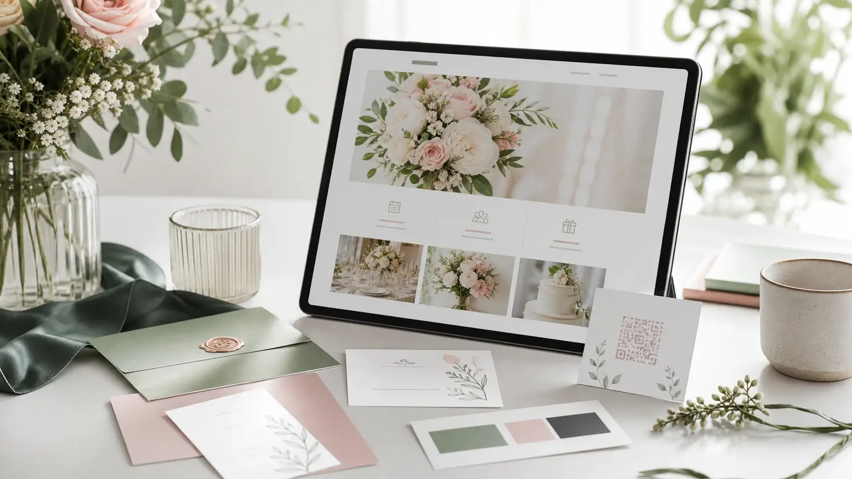
Design examples only work when they are practical: readable type, clear buttons, mobile layout and an address that looks clean on invitations or QR codes. A custom domain can help, but it is less important than the flow.
What makes a layout look expensive is rarely the ornament: one pair of typefaces instead of four, one accent colour, generous white space, short lines. What makes it look cheap is nearly always the same three things — text over a busy photo, script type at body size, grey on beige. Hold an example at arm's length on a phone: what you cannot read there, nobody else reads either.
The address is part of the design, because it gets printed. Short, no chain of hyphens, no letters that invite typos, read aloud once without anyone asking you to repeat it — that is the whole test. Above all it has to be settled before the cards go to print; changing a custom domain afterwards costs you the entire stack.
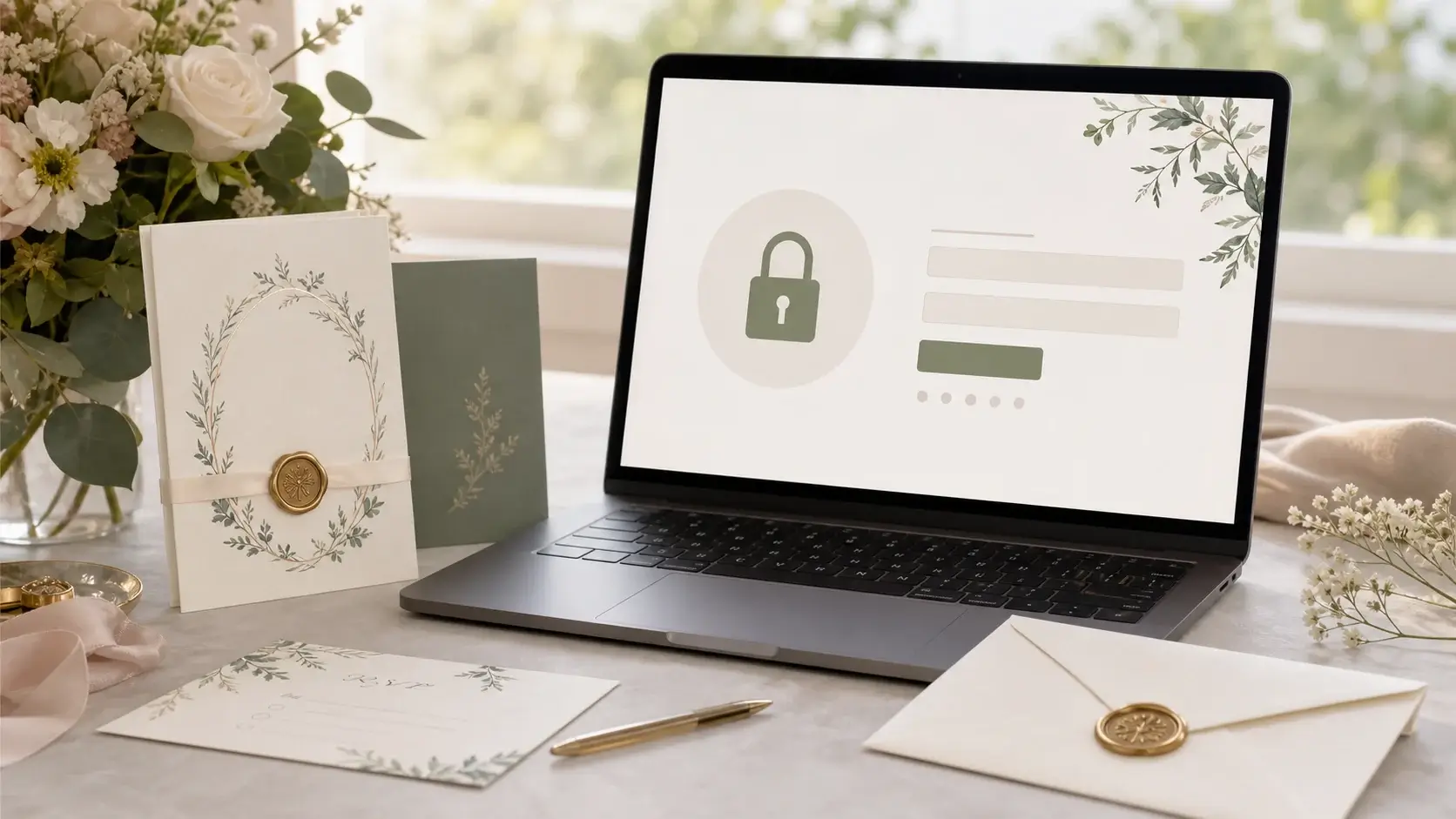
Private details should be protected by invite code. That lets the public product page rank while your personal wedding details stay away from unnecessary indexing.
Related Articles
4. Check privacy and photo handling
Many examples show names, photos, places and guest information. A real wedding website should be planned with privacy in mind: what can everyone see, what should only invited guests see and which data needs to be exportable?
An unfriendly question helps when reviewing other people's examples: which of this would I show a stranger? Full guest lists, phone numbers, the couple's home address and the note that a flat stands empty on a known date belong behind the access — usually the detailed schedule does too.
Galleries add a second point: guests upload pictures of other guests. One sentence on the page settles most of it — who can see the images, who may download them and when the photo gallery with guest upload closes. Anyone who would rather not appear in it also needs someone to ask, without having to say so in front of everybody.
In practice, RSVP, guest list and gallery belong to a private workflow instead of an openly searchable example page.
5. Checklist for your page
Before starting, check: is the intro clear, are date and venue visible on mobile, does RSVP work without an app, are invite code, gallery, guest questions and domain covered?
More useful than a feature list is a checklist along the timeline:
- Before printing: the address and the access code are settled and the RSVP deadline is chosen.
- Before sending: send yourself a test reply and check that it arrives and where it lands.
- After the deadline: export the list and ring the guests who are missing — no page chases them for you.
- After the celebration: open the gallery, pull the addresses for thank-you cards, set a date for deleting the rest.
Once those basics are solved, the design can stay simple. A good wedding website feels polished because it guides guests and reduces work for the couple.
Wedding website examples are most useful when they improve the actual guest flow. Getting Married helps couples build a private site with RSVP, invite code, guest list and optional custom domain.
What the good examples share is unspectacular: one message per screen, one clear action, everything else below it. So do not compare layouts — count the steps to a confirmed reply, and the shorter path usually wins.
And copy nothing you do not want to maintain. Whether it ends up a slim page or a full site is a question of features, not of wording.
Planning your dream wedding?
Create your own wedding website in minutes – with RSVP function, photo gallery, and more.