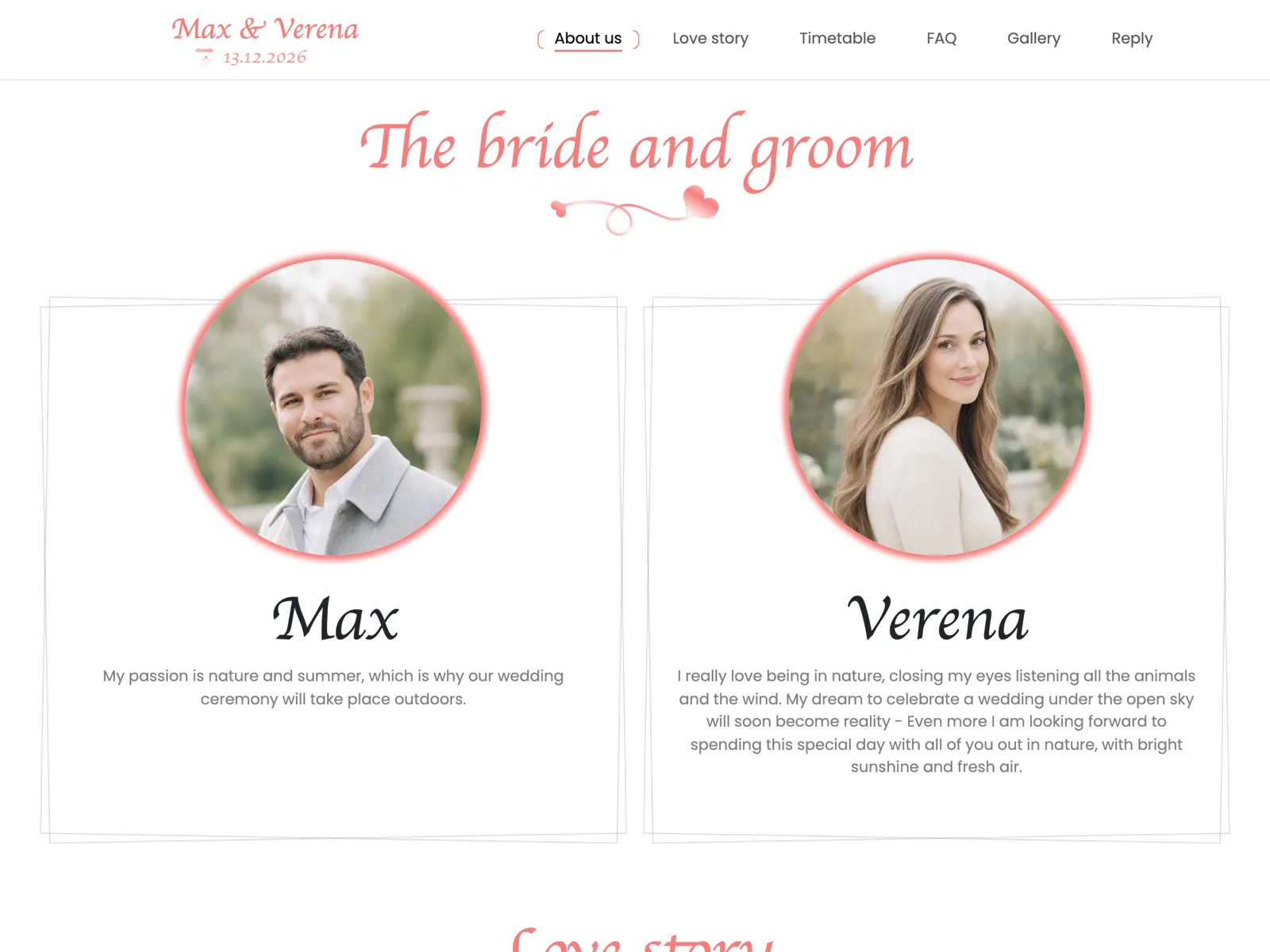
Rosé
Fits Classic, romantic summer weddings: pastel flowers, an outdoor ceremony, plenty of daylight. The warmest of the six and the least demanding.
Open live previewThis page does not describe what a good wedding website looks like — it shows you six. Every one of them carries the same features: online RSVP, an invite code that keeps the page to your guests, a photo gallery and a seating plan. Click through the live previews and pick the one that fits your day. Whether you call it a wedding website, a wedding homepage or simply a wedding page: it is the same thing, and here it is in six versions.
All six previews are real pages of the product filled with example data — no video, no mockup.
Each card shows how a wedding page is laid out in that design's colours: hero, countdown, RSVP block. One click opens the same page live in your browser.
Fits Classic, romantic summer weddings: pastel flowers, an outdoor ceremony, plenty of daylight. The warmest of the six and the least demanding.
Open live preview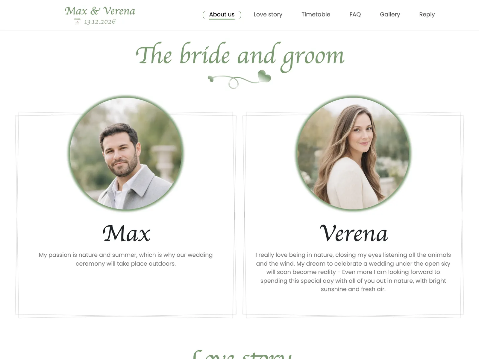
Fits Weddings close to nature — a barn, a vineyard, a clearing in the woods. Eucalyptus, linen, laid tables, and a green that never outshines your photos.
Open live preview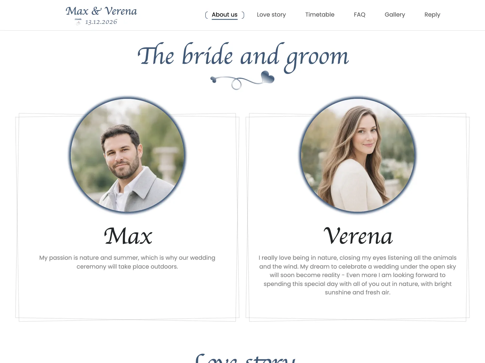
Fits Evening weddings with dinner and a dress code, a city venue, the registry office in the morning. Formal without turning cold.
Open live preview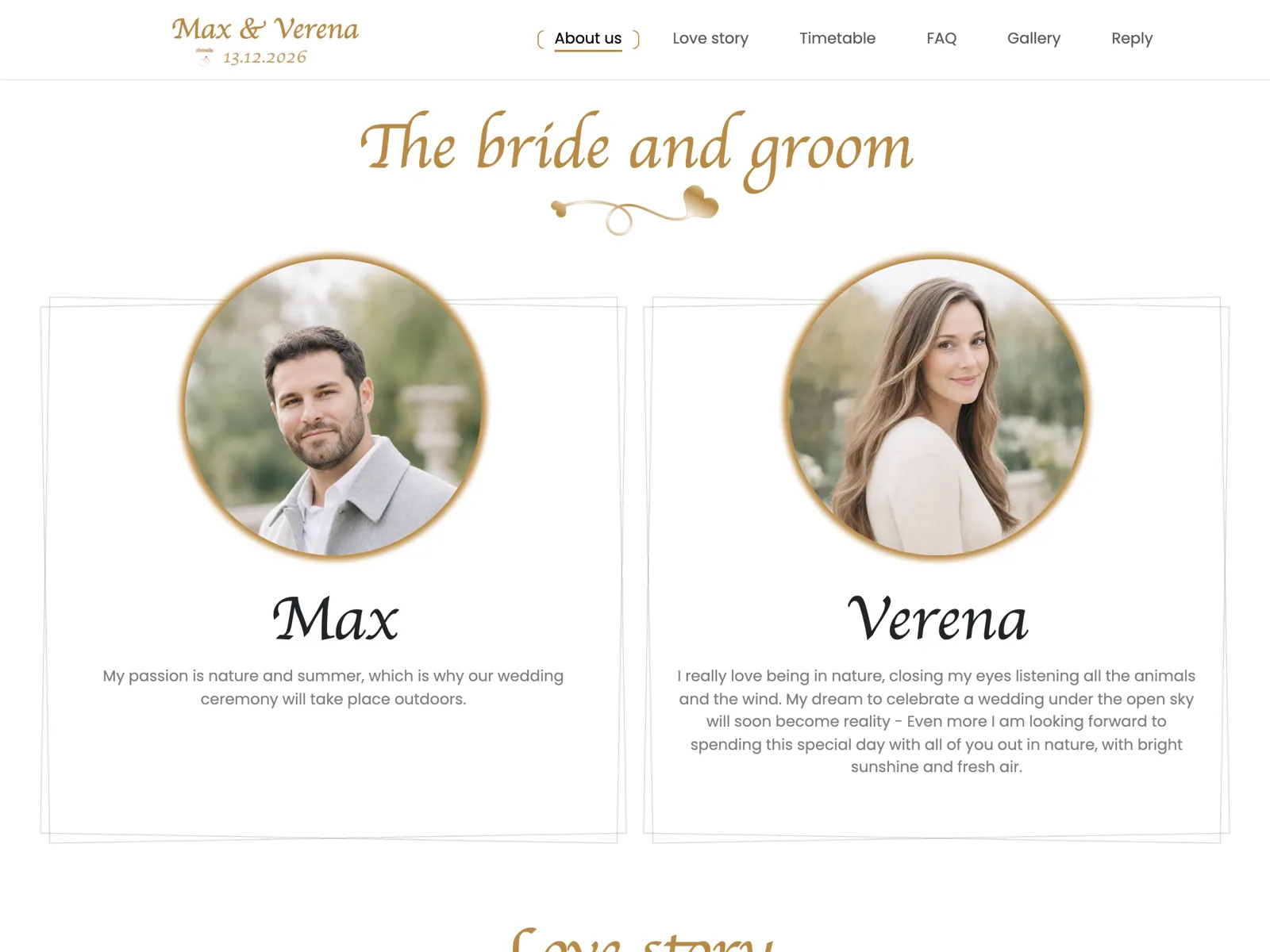
Fits Big, festive celebrations: a castle, a ballroom, a long running order. Gold carries a lot of text without looking busy.
Open live preview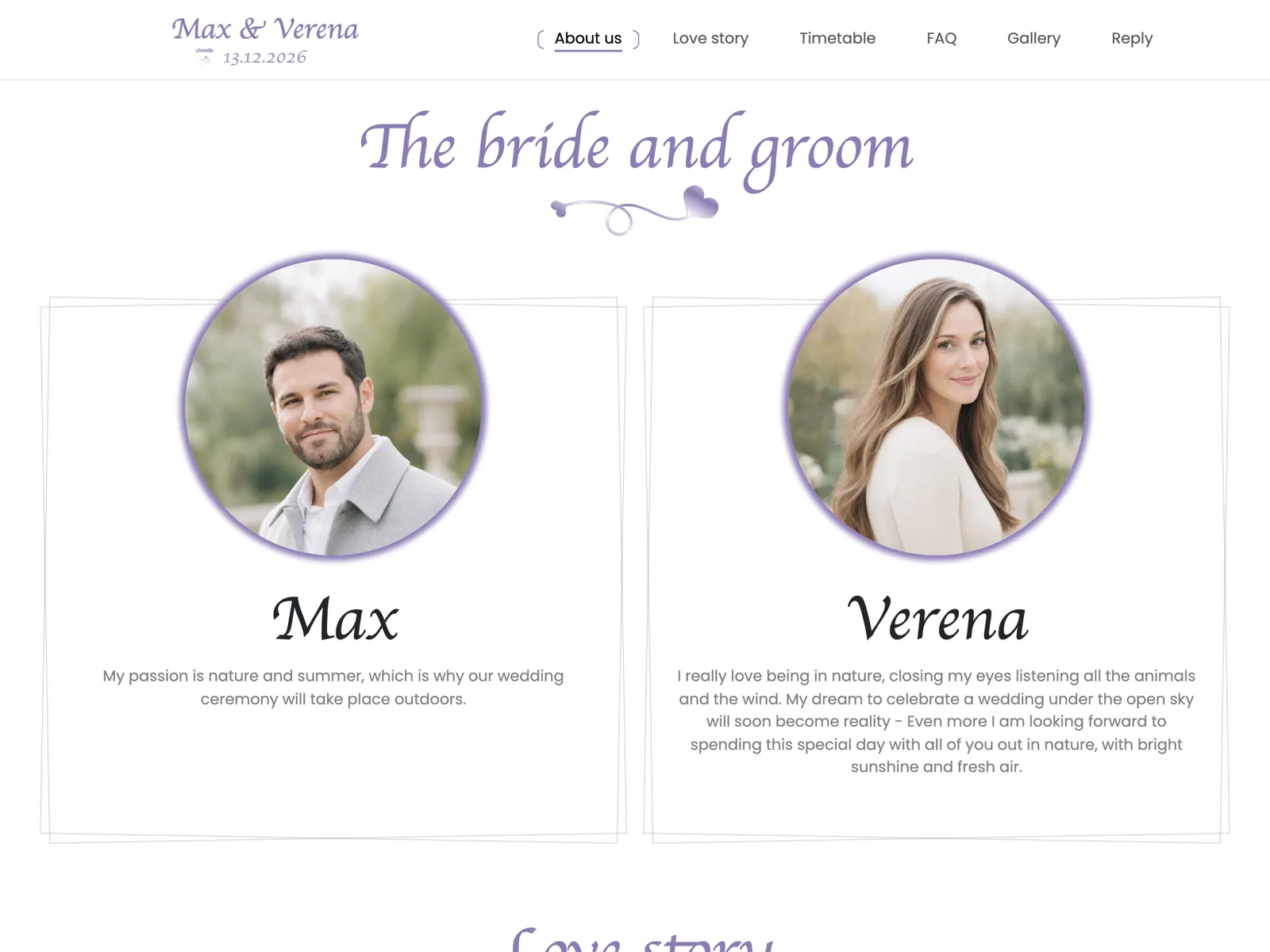
Fits Spring weddings and boho celebrations with plenty of pictures. The softest of the six — good when the photos are meant to lead.
Open live preview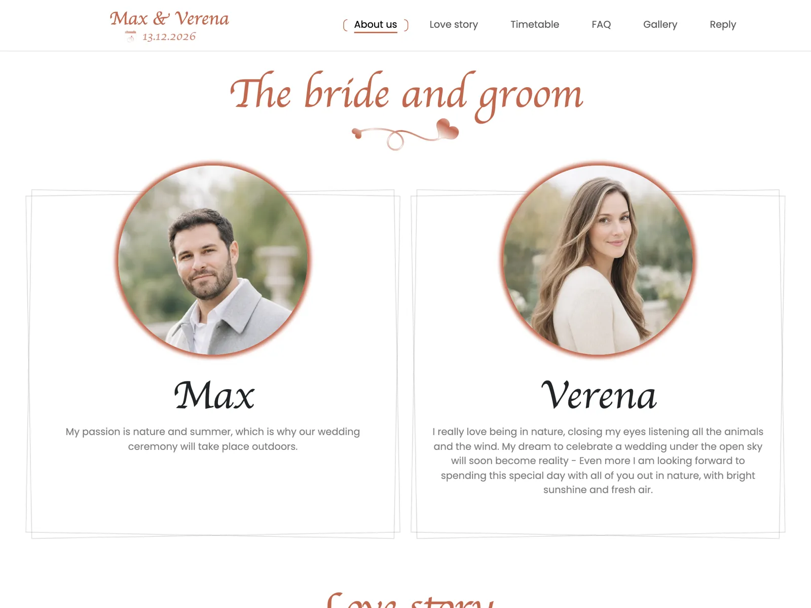
Fits Mediterranean and autumn celebrations: an olive grove, dried flowers, candlelight. Warm, earthy, and at its best after sunset.
Open live previewThe same page, set seven ways. Each card shows the hero: the couple's names in the display face, with the ornaments that belong to it. One click opens the page live.
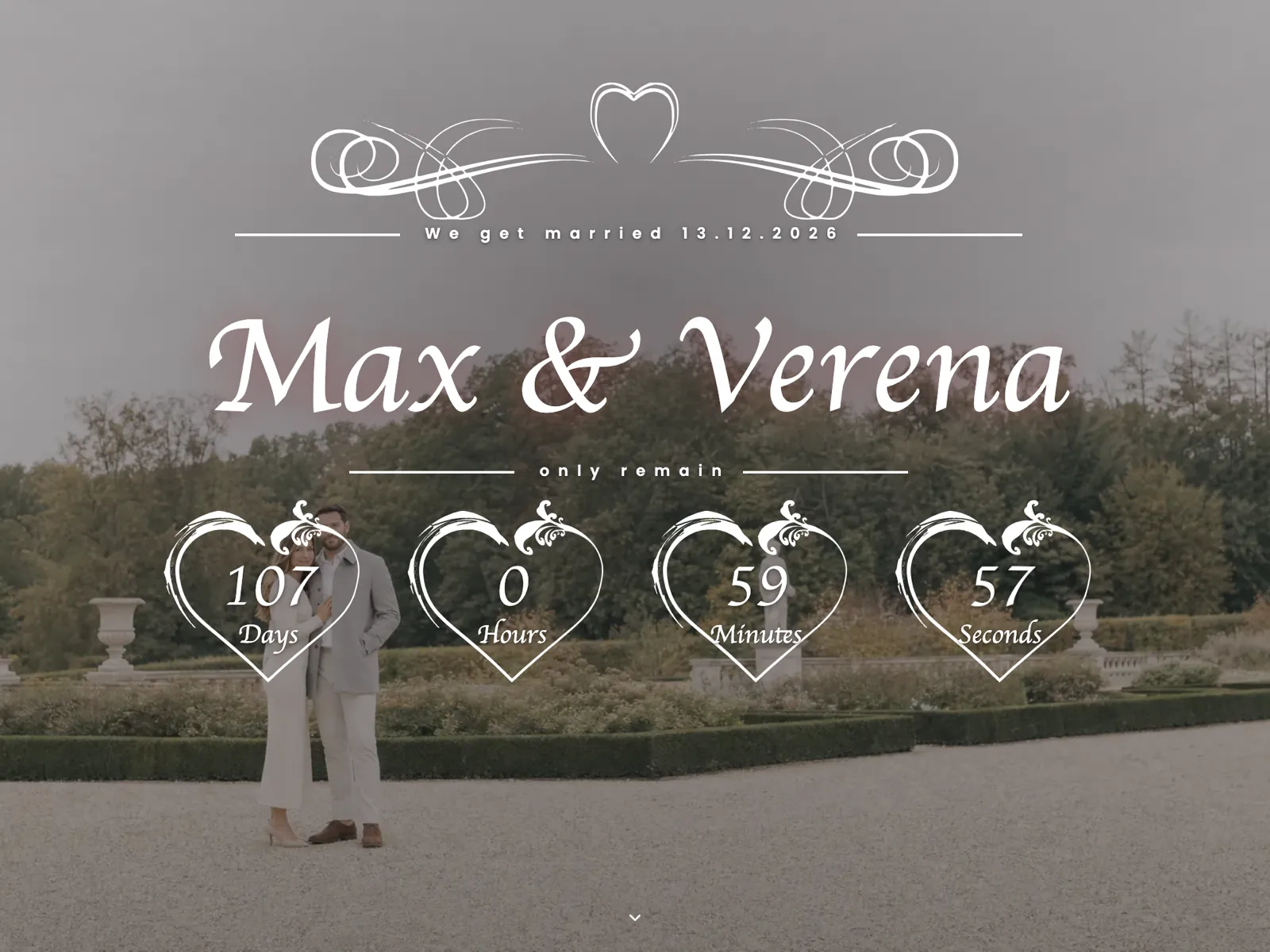
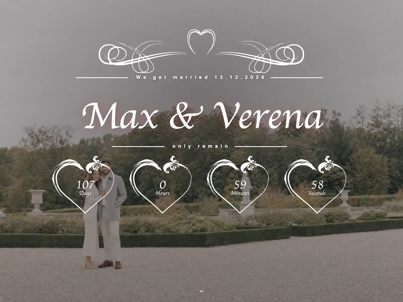
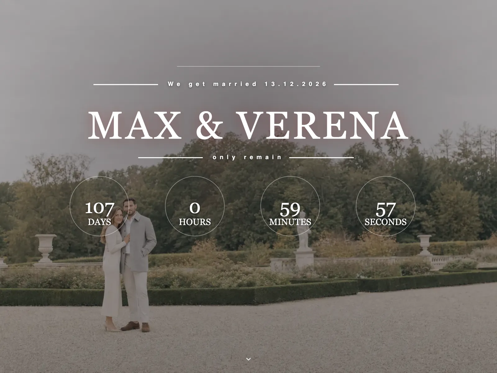
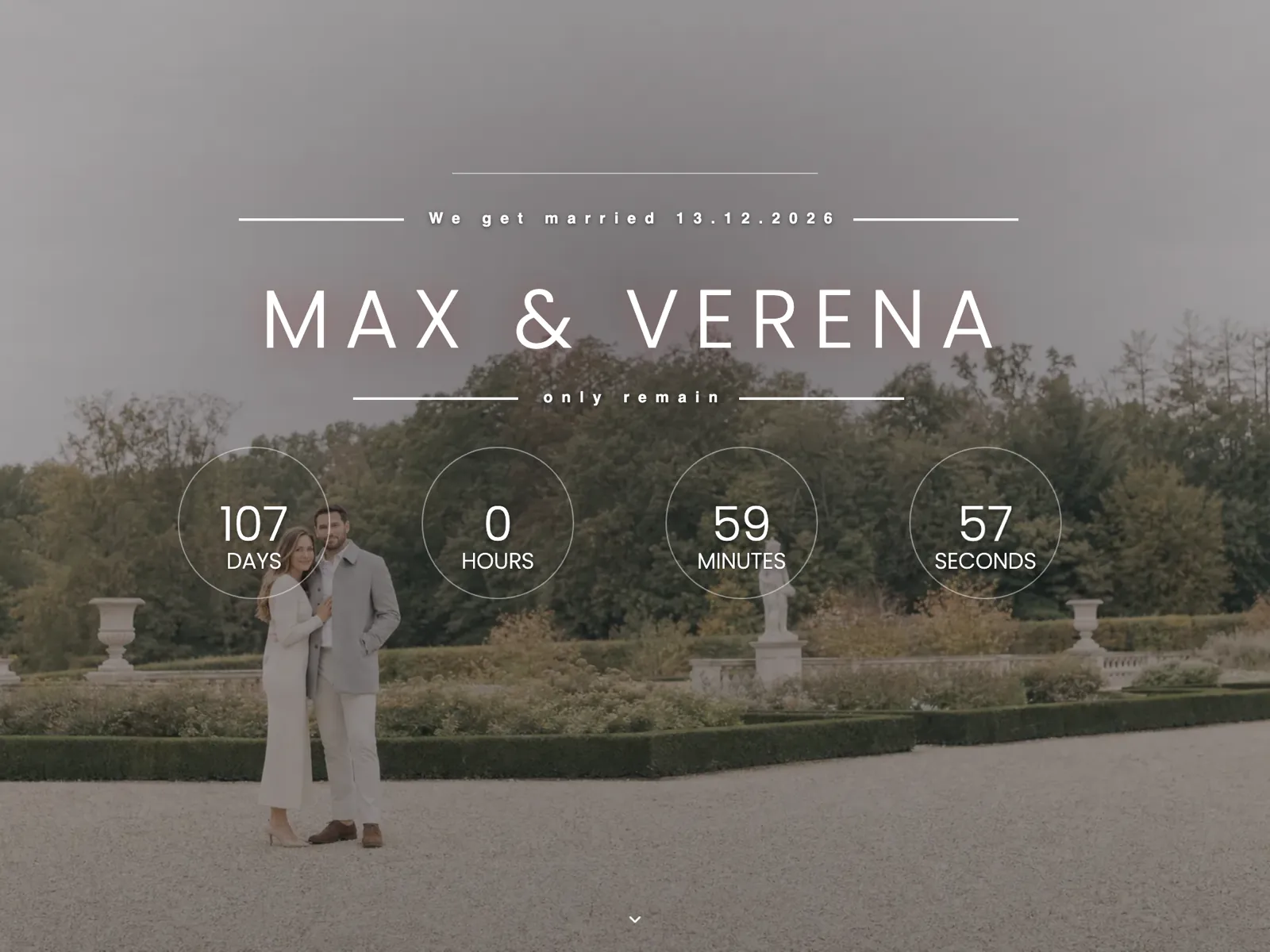
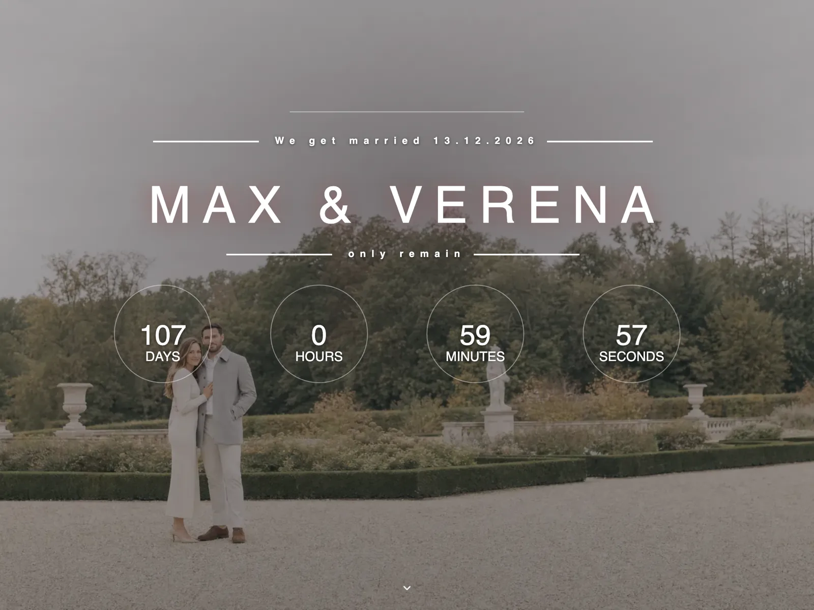
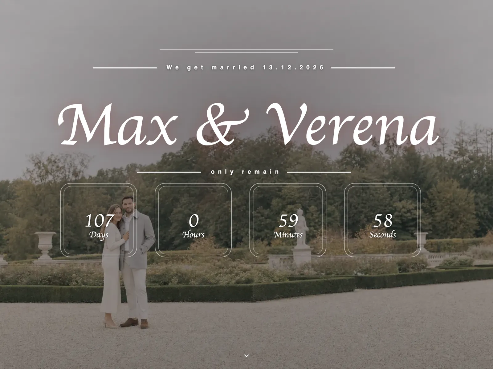
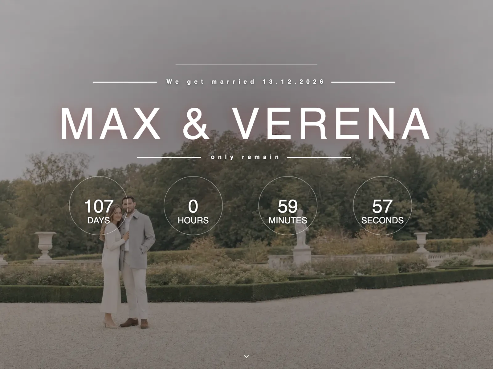
All six do the same things. They differ in colour, contrast and how much room they leave the photographs — and that is decided by your celebration, not by the screen. Four questions usually settle it.
Outdoor summer weddings carry light, warm tones such as Rosé or Lavender; for autumn and winter celebrations by candlelight, Terracotta and Midnight blue sit closer. Look at the preview in the light your guests will open the page in.
A barn, a vineyard or a clearing in the woods sit well with Sage, a castle or a ballroom with Gold, a city venue or the registry office with Midnight blue. The design may echo the venue without copying it.
If you have plenty of pictures, take a design that steps back: Lavender and Rosé let the photos lead. If you only have a few shots so far, a stronger tone such as Gold or Terracotta carries the page without a long picture run.
A long running order with a dress code, a seating plan and a shuttle needs a design that keeps a lot of text calm; Gold and Midnight blue do that. A small, informal celebration is fine with a soft tone.
A wedding website is not a poster. It has six jobs to do, and you can hold every example against them — including the ones on other providers' sites.
The three things guests open the page for belong in the hero. Everything else can wait below it.
Guests answer in one click instead of by email, meal choice and notes included. You can see where you stand at any moment.
An invite code protects the address, the running order and the guest list. Without the code there is nothing to read.
Guests upload their pictures straight to your page. No messenger album, no stranger's cloud, no adverts in between.
The seating plan is built from the same data as the replies and ends in a printable chart, place cards and a caterer summary as PDFs. Included in every package.
Eight languages are ready to go, so guests from abroad read your page in theirs and you never maintain anything twice.
Example images of wedding pages almost always show the same perfect crop. That is why our six previews really open — and why it pays to try three things yourself on every example instead of looking for them in a picture.
Most guests get the link in a messenger and tap it on the way somewhere. A wedding page has to work on a narrow screen first: the date readable without zooming, buttons within reach of a thumb, no line running off the side.
A screenshot shows a form, not the path through it. Open the RSVP block in the preview and walk it: how many fields are required, how are plus-ones recorded, what happens after you send it?
Examples carry short sample texts of equal length. Your directions, your accommodation tips and your running order are longer. Read the preview with your own content in mind: does the page stay clear with three more paragraphs?
No. All six previews show the same example wedding, with invented names and stock imagery. Real couples' pages sit behind an invite code and are never shown in public — which is rather the point.
Yes, the six are starting points. You choose your own base colour, your own hero image, how the countdown section looks, and you write every word yourself. The layout stays; the handwriting becomes yours.
Yes. Wedding website, wedding homepage and wedding page all mean the same thing — your own page for your wedding. Whichever term you use changes nothing about the six previews; each shows the same layout.
Two short paragraphs are enough: how you met and how the proposal went, with a photo each. Guests read that part once — the rest of the page they come back to, which is why it sits below the key facts rather than above them.
Yes, and that is the usual way. The hero image, the about-us photos and the pictures along the running order are swapped for your own; the example pictures only exist so the previews are not empty. Missing images can follow later without changing the design.
Six, and each of them carries the full feature set: RSVP, invite code, QR code, gallery, seating plan and your own address. You choose on looks, not on what is included.
Three guide articles that pick up where the previews stop: the seating plan, the exit from the church and the comparison of features.
A seating plan is half geometry and half diplomacy. The geometry can be worked out: a round table takes eight to ten, a long banquet row changes who talks to whom, and the staff still need room to pass between them. The diplomacy cannot be worked out — and both halves fall due on the same date, while replies are still arriving.
The choice comes down to three things that have little to do with taste: the time of day, what your venue's house rules allow, and how long you need to walk the length of the tunnel. Short sparklers burn for half a minute, the long ones for closer to two. Settle the house rules first, then choose the material.
Every wedding website tool shows a longer feature list than the one before it, and almost none of them is wrong. This guide gives you an order instead of a list: three features carry the page, a few only start counting after the first yes, and the rest quietly cost attention you need elsewhere.
Modern, elegant and personal. Design for free; you only pay when you send the invitations, with fair one-time pricing.
Get started for free